Why I love retro websites?
Author's note:“After joining uni, several people asked me why my website looks the way it does. Many assumed that I am new to web development, which is not entirely true. It is difficult to explain to everyone the reason. Convincing people that I simply love the aesthetic of older websites and that my website doesn’t have a retro look because I don’t know how to design is challenging.
In the past, I have worked on several modern-looking websites, and I do have experience with modern designing. It’s just that I’m more into retro stuff than modern stuff.
On that note, please continue reading ahead :>“
Have you ever taken a trip down memory lane through the Wayback Machine?
It’s a fascinating journey into the evolution of website design. Seeing familiar websites from years ago is like discovering buried treasures. You might wonder why I love retro websites so much; let me share my reasons.
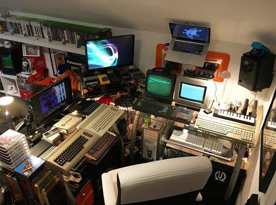
There’s something captivating about how websites used to look. The simplicity and rawness of old designs transport me back in time. It’s like flipping through an old photo album, but instead, I’m exploring the digital past. Familiar websites, now transformed, remind me of how far we’ve come in the digital world.
Now imagine a place where people come together to celebrate the aesthetics of the past. That’s Neocities for you. It’s a vibrant community where individuals create retro websites that breathe new life into the old web. The passion and creativity of this community never fail to bring me joy.
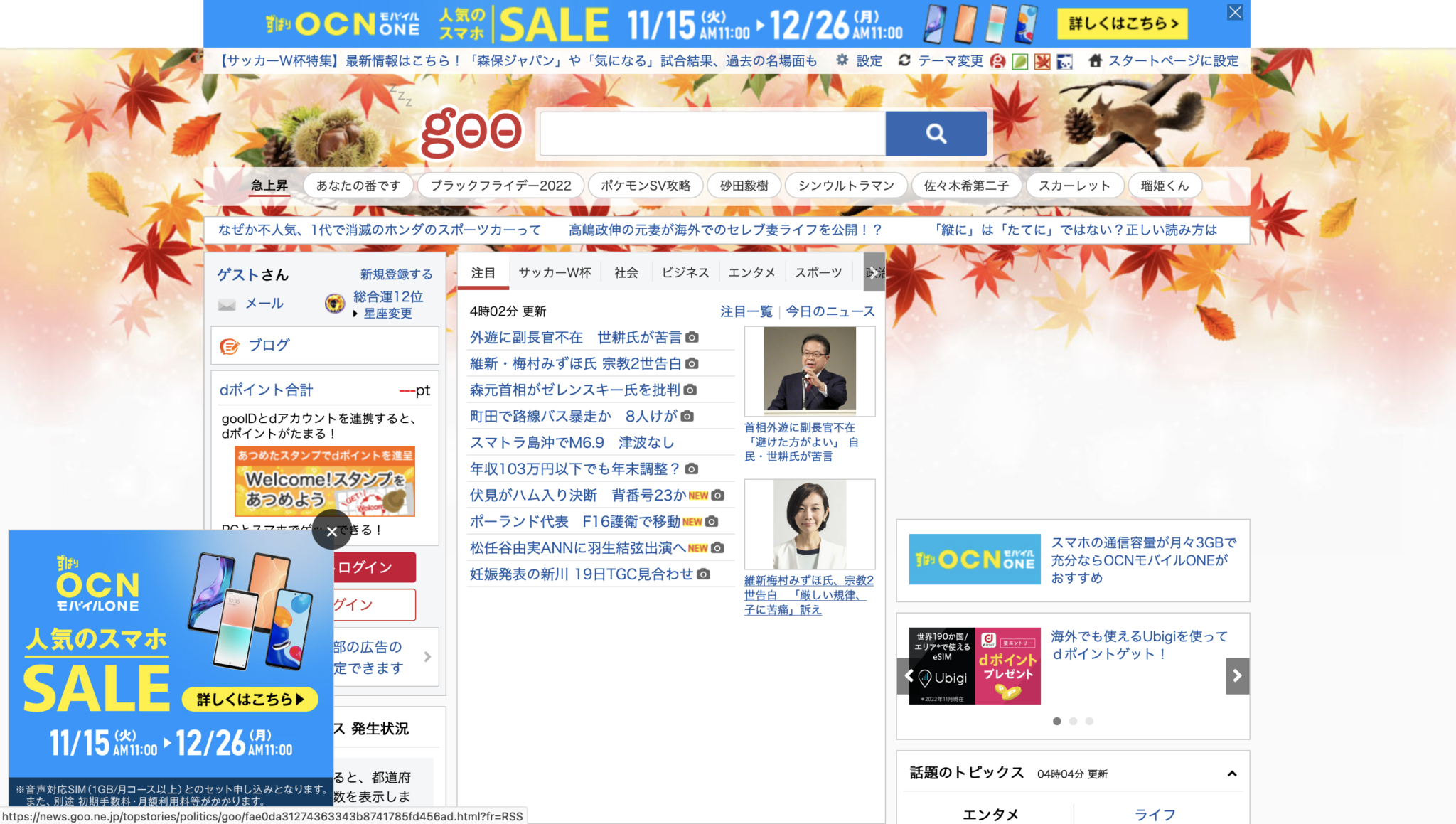
Speaking of retro charm, Japanese websites have a unique appeal. They often embrace a cluttered look with a focus on essential information. While some might find this approach boring, I’m captivated by its simplicity. There’s a certain elegance in the minimal use of graphics and the laser focus on what truly matters.
There is a good article explaining and going in depth of why Japanese websites are built that way, and you can check that out here.
Retro websites aren’t about perfection; they’re about authenticity. They remind me of a time when the web was a wild frontier, unburdened by today’s sleek, cookie-cutter designs. These sites are like digital time capsules, preserving a piece of internet history.
In a world where web design trends are ever-changing, retro websites offer a delightful contrast. They remind me of the early days of the internet, when creativity knew no bounds, and the web was a canvas for experimentation.
In conclusion, my love for retro websites stems from the nostalgia they evoke, the vibrant Neocities community, the elegance of Japanese web design, and the beauty of imperfection they represent. While they may not appeal to everyone, they hold a special place in my heart. So, why do I love retro websites? Because they remind me that sometimes, the past has a unique beauty worth preserving.
Keep exploring the digital past with these amazing resources and communities!

